
Introduction
Prototype testing is what ends design arguments that go nowhere. Instead of another meeting-room debate about whether a checkout flow is “intuitive,” teams can watch real users try it. And get a clear answer fast.
One designer may love a three-step process, another may call it confusing, a developer may want everything on one page. Until users are involved, it’s all opinion.
This scene repeats daily across retail, finance, travel, and insurance. Critical product decisions are made based on assumptions and gut feelings, not evidence. And the cost of getting it wrong is huge. The Rule of Ten in software engineering shows that fixing a design issue during development costs 10× more than catching it early, and a hundred times more after launch, once support tickets, rushed fixes, and brand damage stack up.
Prototype testing changes that equation. By testing early versions of a product with real users, teams can validate flows, interfaces, and ideas while changes are still quick and inexpensive. For UX Designers in agile sprints, CX Managers focused on customer satisfaction, and Product Leaders accountable for ROI, this turns product development from educated guessing into informed decision-making.
Key takeaways
- Prototype testing validates concepts before expensive engineering begins, reducing the risk of building features nobody needs or can use effectively
- Different prototype fidelity levels serve distinct purposes: low-fidelity for concept validation, high-fidelity for detailed usability testing, and mid-fidelity for balancing speed with realism
- Continuous discovery integrated into agile sprints delivers faster, more confident decision-making than sporadic, project-based research
- Quantitative metrics like success rate, time on task, and error rate combined with qualitative insights create actionable design improvements backed by evidence
- Modern platforms enable teams to gather user feedback in 24 hours rather than weeks, accelerating iteration cycles and replacing guesswork with systematic insights
What is prototype testing and why does it matter?
Prototype testing is the process of evaluating a preliminary version of a product with real users during the design and development phases, not after the product is finished. These preliminary versions range from rough paper sketches to highly interactive digital models that closely resemble the final product. The fundamental difference between prototype testing and post-launch usability testing is timing: prototype testing happens when changes are still inexpensive and fast to implement, while post-launch testing often reveals problems that require costly emergency fixes.
Unlike A/B testing, which compares two versions of an existing feature to optimize conversion rates, prototype testing validates whether a concept should exist at all. It answers three critical questions before significant resources are committed:
- Is this feasible to build?
- Can users actually navigate and use it?
- Do users want this feature enough to change their behavior?
This validation occurs across three dimensions. Feasibility testing ensures the design team isn’t proposing something technically impossible or prohibitively expensive. Usability testing identifies friction points, navigation hurdles, and moments where users get confused or stuck. Desirability testing determines whether the concept solves a real problem users care about, or if it’s a solution searching for a problem.
In Lean UX and Agile methodologies, prototype testing replaces the traditional waterfall approach where teams spend months building something before getting any user feedback. Instead, rapid feedback loops allow teams to test assumptions weekly or even daily. This “fail fast, learn fast” philosophy is particularly valuable in consumer-facing industries like retail, finance, travel, and insurance, where customer expectations evolve rapidly and switching costs are low. A confusing insurance claim process or a checkout flow that takes too many steps can send customers directly to a competitor.
For CX Directors and Product Leaders, prototype testing serves as a risk mitigation strategy. It provides empirical evidence to settle internal debates, shifting conversations from subjective opinions to objective user data. When stakeholders disagree about button placement or navigation structure, user testing provides the answer. More importantly, it prevents the expensive mistake of building features based on executive assumptions rather than customer needs.
“The cost-benefit equation is compelling. Catching a design flaw during a paper mockup session might cost a few hours of a designer’s time. The same flaw discovered during development requires rework from designers, developers, and QA testers.”
Discovered after launch, it demands emergency engineering, creates customer support tickets, and potentially damages brand reputation. This exponential cost increase is why prototype testing isn’t a luxury for teams with extra time—it’s a strategic necessity for organizations that want to maximize their development ROI.
Understanding prototype fidelity levels and when to use each
Fidelity refers to how closely a prototype resembles the final product in terms of visual detail, interactivity, and polish. Choosing the right fidelity level is crucial because it determines what kind of feedback you’ll receive and how much time you’ll invest in creating the prototype. The key principle is matching fidelity to your research question. If you’re testing whether users understand a core concept, a high-fidelity prototype with perfect animations is overkill. If you’re testing subtle interaction patterns and micro-interactions, a paper sketch won’t provide the realism you need.
Low-fidelity prototypes: rapid concept validation

Low-fidelity prototypes are intentionally rough. They include paper sketches, hand-drawn wireframes, and basic digital wireframes created in tools like Balsamiq. These prototypes deliberately lack visual polish, using placeholder text, simple boxes for images, and minimal color.
Use lo-fi prototypes during the discovery phase when you’re testing fundamental concepts, information architecture, and high-level user flows. They’re ideal for answering questions like “Do users understand what this product does?” or “Can users find the information they need in this navigation structure?” Because they look unfinished, users focus on functionality and flow rather than getting distracted by colors, fonts, or specific icons.
The advantages are speed and cost. A designer can sketch multiple navigation concepts on paper in an hour, test them with users the same afternoon, and iterate based on feedback the next morning. This rapid cycle is impossible with high-fidelity prototypes that require days to build. Additionally, users feel more comfortable giving honest, critical feedback when the prototype looks rough. They’re less worried about hurting feelings or criticizing something that appears “finished.”
The limitation is lack of interactivity. Paper prototypes require a facilitator to manually swap screens as users “click” on elements, which can feel artificial. Users may also struggle to imagine the final experience, particularly for complex interactions or animations that are difficult to simulate on paper.
High-fidelity prototypes: detailed usability validation
High-fidelity prototypes are interactive, visually polished simulations created in tools like Figma, Adobe XD, or Axure. They include realistic data, final brand assets, animations, and micro-interactions. When users interact with a hi-fi prototype, the experience closely mirrors what they’ll encounter in the finished product.
Use hi-fi prototypes during the late design phase when core concepts are validated and you need to test execution quality. They’re essential for:
- Detailed usability testing
- Final validation before development begins
- Stakeholder presentations
- Accessibility checks
Hi-fi prototypes reveal subtle interaction issues that lo-fi versions miss: Is the button placement optimal? Do users notice the micro-animation that indicates loading? Does the visual hierarchy guide users’ attention correctly?
The advantage is realism. Users interact with hi-fi prototypes naturally, providing feedback that accurately predicts how they’ll respond to the final product. This is particularly valuable for testing emotional responses and brand perception, which are difficult to assess with wireframes.
The limitations are time and cost. Building a hi-fi prototype can take days or even weeks, depending on complexity. This investment only makes sense when you’re confident in the core concept and need to validate execution details. Additionally, users may focus on surface-level details like specific color choices or icon styles rather than fundamental usability issues, which can distract from more important feedback.
Mid-fidelity prototypes: balancing speed and realism
Mid-fidelity prototypes occupy the pragmatic middle ground. They’re digital wireframes with basic navigation and layout but minimal visual design. Buttons are clickable and lead to other screens, but images are placeholders and colors are grayscale.
Use mid-fi prototypes for testing navigation logic, screen sequences, and information hierarchy without the time investment of full visual design. They’re ideal for agile teams who need to validate interaction patterns quickly within sprint cycles. Mid-fi prototypes answer questions like “Does this checkout flow make sense?” or “Can users complete this multi-step form without getting lost?”
The strategic value is efficiency. Mid-fi prototypes provide better flow simulation than lo-fi while being significantly faster to create than hi-fi. This makes them perfect for testing multiple navigation approaches before committing to visual design. For teams working in two-week sprints, mid-fi prototypes offer the best balance of speed and useful feedback.
Core prototype testing methodologies for different research goals
Selecting the right testing methodology is as important as choosing the right fidelity level. The methodology determines what kind of data you’ll collect, how quickly you’ll get results, and what questions you can answer. The fundamental decision is whether to use moderated or unmoderated testing, each serving distinct research goals.
Moderated usability testing: deep qualitative insights
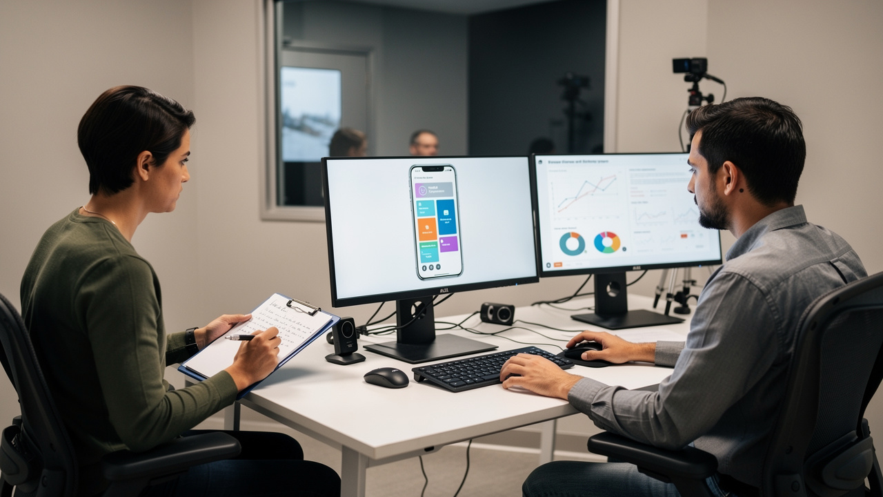
Moderated testing involves a researcher guiding participants through tasks in real-time, either in-person or remotely via video call. The researcher observes as users interact with the prototype, asking follow-up questions to understand the reasoning behind their actions.
This methodology is best for exploratory research where you need to understand the “why” behind user behavior. When a user hesitates before clicking, a moderator can ask “What were you expecting to see?” or “What made you unsure about that option?” These probing questions reveal cognitive friction that quantitative metrics alone can’t capture. Moderated testing is also ideal for testing complex workflows where users might encounter prototype bugs or ambiguous instructions that need clarification.
The advantages are depth and flexibility. Researchers can capture emotional responses, body language, and moments of confusion that automated tools miss. If a user’s facial expression suggests frustration, the moderator can explore that reaction immediately. This real-time adaptation makes moderated testing particularly valuable for early-stage concept validation and testing with specialized user groups, such as accessibility testing with users who rely on screen readers.
The typical process involves:
- Recruiting five to eight participants
- Conducting 45 to 60-minute sessions
- Encouraging a think-aloud protocol where participants verbalize their thought process
For CX Managers, video clips of users struggling with specific features are powerful stakeholder communication tools. Watching a customer get confused is far more persuasive than reading a report that says “40% of users had difficulty with the checkout flow.”
Unmoderated usability testing: scalable, rapid feedback
Unmoderated testing allows participants to complete tasks independently using a platform that records their screen and audio. There’s no researcher present, and users work through predefined scenarios at their own pace, typically in their own environment.
This methodology excels at rapid concept validation, gathering quantitative metrics, and testing within agile sprint cycles. When you need to validate a specific interaction pattern or compare two design variations, unmoderated testing provides results in 24 to 48 hours rather than the weeks required to schedule and conduct moderated sessions. It’s also highly scalable—you can test with 50 or more users simultaneously, something impossible with moderated research.
The advantages are speed, scale, and cost efficiency. Platforms like UserTesting, Maze, and Lookback enable automated recruitment from large participant panels, eliminating the time-consuming process of finding and scheduling users. Participants test in their natural environments, which often reveals context-specific issues that wouldn’t emerge in a lab setting. For example, testing a mobile banking app while users are actually at home provides more realistic feedback than testing in an office conference room.
Unmoderated testing is ideal for gathering baseline usability metrics like success rates and time on task, which are essential for reporting to stakeholders. Product Leaders can use quantitative data to support design decisions with concrete evidence rather than subjective opinions. The connection to continuous discovery is direct: unmoderated testing enables frequent validation without creating researcher bottlenecks, allowing teams to test multiple concepts within a single sprint.
Preference testing and first-click analysis
Preference testing shows users two or more design variations and asks which they prefer and why. This methodology is particularly valuable for Marketing and Campaign Teams testing visual concepts, taglines, or landing page designs. Rather than debating internally about which hero image resonates more, teams can get quantified user preferences in hours.
First-click testing measures where users click first when attempting to complete a task. This metric is surprisingly predictive: research shows that if a user’s first click is correct, they have an 87% chance of successfully completing the task. If the first click is incorrect, success rate drops to just 46%. This makes first-click testing a powerful diagnostic tool for identifying navigation problems early.
The strategic value of these rapid methods is clear, quantified signals for design decisions. When stakeholders disagree about which approach is better, preference testing provides an objective answer. These tests can be deployed in the morning and provide actionable results by afternoon, making them ideal for fast-paced environments where decisions can’t wait for lengthy research projects.
How to run effective prototype tests: a step-by-step framework
Running effective prototype tests requires structure. Without clear objectives and methodology, you’ll collect data but lack actionable insights. This framework ensures that every testing session yields valuable, implementable feedback.
Step 1: Define clear research objectives and hypotheses
Start with specific, testable questions rather than vague goals. Instead of “Let’s see if users like the new design,” ask “Can users complete a purchase in under 90 seconds using the one-page checkout?” This specificity determines everything else: which prototype fidelity to use, which testing methodology to employ, and which metrics to track.
Frame objectives as hypotheses with measurable success criteria. For example: “We believe that consolidating the checkout process to one page will enable users to complete purchases 20% faster than the current three-page flow.” This hypothesis defines what you’re testing (checkout consolidation), what you’re measuring (completion time), and what would constitute success (20% improvement).
Align objectives with business goals by connecting UX improvements to KPIs. If the business goal is reducing cart abandonment, your testing objective might focus on identifying friction points in the checkout flow. If the goal is increasing feature adoption, test whether users understand the value proposition and can find the feature without assistance. This alignment ensures testing delivers insights that stakeholders care about, not just interesting observations.
Step 2: Recruit the right participants
Testing with colleagues or friends invalidates your results. Internal employees already understand your product’s mental model and terminology. Friends want to be supportive and may unconsciously give positive feedback. Testing with the wrong people is genuinely worse than not testing at all because it creates false confidence in flawed designs.
Use screener surveys to recruit participants who match your actual target personas. If you’re designing a budget airline booking app, recruit frequent travelers who regularly use budget carriers, not business travelers who prioritize premium services. If you’re testing accounting software, recruit small business owners who manage their own books, not professional accountants with specialized training.
For CX Managers, this means ensuring tester demographics mirror your actual customer base:
- If 60% of your customers are mobile users, at least 60% of your test participants should use mobile devices
- If your primary market is users aged 45 to 65, don’t test exclusively with 25-year-olds because they’re easier to recruit
Sample size depends on your research goals. For qualitative usability testing, Jakob Nielsen’s research shows that five users uncover approximately 85% of usability issues. For quantitative preference testing or statistical validation, recruit 20 to 30 or more participants. Platforms like UserTesting provide access to large participant panels, while customer communities enable testing with your own users.
Step 3: Create realistic scenarios and task scripts
Task design determines the quality of feedback you receive. Leading questions that telegraph the correct action invalidate results by creating artificially high success rates.
Avoid instructions like “Click the green ‘Add to Cart’ button.” This tells users exactly what to do, bypassing the discovery process that reveals usability issues. Instead, create scenarios that reflect real-world context: “You’re looking for a gift for a friend under £50. Find an item you like and proceed to the point of purchase.” This scenario provides motivation and context without revealing the interface elements users should interact with.
Use neutral language that doesn’t hint at expected paths. Don’t say “Use the search function to find…” because this assumes users will use search. Instead, say “Find a product that meets these criteria” and observe whether users naturally gravitate toward search, browse categories, or use filters.
For moderated tests, prepare follow-up probes in advance. When a user hesitates, ask “What were you expecting to see?” or “How did that make you feel?” These open-ended questions reveal the cognitive friction behind observable behavior.
Step 4: Conduct the test and observe behavior
During testing, your primary job is observation, not intervention. Encourage participants to use the think-aloud protocol, verbalizing their thought process as they work. This narration reveals the gap between what users do and what they intend to do.
For moderated tests, observe:
- Body language
- Emotional responses
- Hesitations
- Moments of confusion
A furrowed brow or frustrated sigh often indicates a usability problem even if the user eventually completes the task. Take notes on both actions and commentary, because these often diverge. A user might say “This is easy” while taking three wrong turns to complete a simple task.
For unmoderated tests, review recordings systematically, looking for patterns in navigation, error recovery attempts, and task abandonment. If multiple users make the same wrong turn, that’s a design flaw, not user error.
Avoid intervening unless the user is completely stuck due to a prototype bug rather than a design issue. If a user struggles because the prototype doesn’t respond to a click, you can clarify. If they struggle because they can’t find the button, that’s valuable feedback about your design.
Step 5: Analyze findings and prioritize iterations
Analysis begins by looking for patterns. If one user struggles with a feature, it might be an outlier or a misunderstanding of the task. If three or more users struggle with the same element, you’ve identified a design flaw that needs fixing.
Use the Traffic Light system to prioritize issues:
- Red issues are critical problems that prevent task completion—users can’t proceed, abandon the task, or express significant frustration. These require immediate fixes.
- Amber issues are minor frustrations or delays that don’t prevent completion but create friction. These should be addressed in the next iteration.
- Green interactions are successful, positive experiences that you should preserve and potentially expand.
Quantify findings by calculating success rates, average time on task, and error rates. These metrics provide objective measures of improvement across iterations. If your initial prototype had a 60% success rate and your revised version achieves 85%, you’ve demonstrated measurable progress.
Create highlight reels by compiling short video clips of users struggling with specific features. For stakeholders who didn’t observe testing sessions, watching a customer get confused is far more persuasive than reading statistics. These clips transform abstract data into concrete, empathetic understanding of user challenges.
Key metrics for measuring prototype testing success
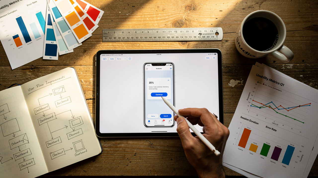
Qualitative insights reveal why users struggle, but quantitative metrics prove the magnitude of problems and track improvement over time. For Product Managers and CX Directors reporting to executives, these metrics translate UX improvements into the language of business ROI.
| Metric | What It Measures | Industry Benchmark |
|---|---|---|
| Success Rate | Percentage of users who completed a task without assistance | 78% or higher is considered good usability |
| Time on Task | How long users take to complete a workflow | Sudden increases indicate confusion |
| Error Rate | Incorrect clicks, wrong paths, or unclickable element interactions | High rates signal unclear UI |
| System Usability Scale (SUS) | Global usability score from 0-100 | Scores above 68 are above average |
| Net Promoter Score (NPS) | Likelihood to recommend | Connects UX to brand loyalty |
| First-Click Success | Whether users’ initial instinct aligns with intended path | Strong predictor of overall success |
Success rate measures the percentage of users who successfully completed a predefined task without assistance. If only 50% of users can complete your checkout flow, you have a critical problem. Track this metric across iterations to demonstrate improvement. Moving from 50% to 85% success rate provides concrete evidence that design changes are working.
Time on task measures how long users take to complete a workflow. Sudden increases indicate confusion or poor navigation. If users previously completed account registration in two minutes but now take five minutes, something in the new design is causing friction. This metric is particularly valuable for workflows where speed matters, such as checkout processes, form completion, or emergency service requests.
Error rate counts incorrect clicks, wrong paths taken, or attempts to interact with unclickable elements. High error rates signal unclear UI or violated user expectations. If users repeatedly click on text that looks like a link but isn’t, your visual design is misleading. If users consistently take wrong turns in navigation, your information architecture needs revision.
System Usability Scale is a standardized 10-item questionnaire that provides a global usability score ranging from 0 to 100. Scores above 68 are considered above average. SUS enables comparison across products and iterations, providing a single number that executives can track over time. While it doesn’t tell you what’s wrong, it provides a reliable benchmark for overall usability.
Net Promoter Score and Customer Satisfaction measure emotional response and likelihood to recommend. These metrics connect UX quality to brand loyalty and word-of-mouth marketing. A product with excellent functionality but poor usability will score low on NPS because users won’t recommend something that frustrates them.
First-click success is a critical leading indicator. Research consistently shows that if users’ initial instinct aligns with the intended path, they’re far more likely to complete the task successfully. This makes first-click testing a powerful diagnostic tool for identifying navigation problems before they cascade into larger usability issues.
“For Digital Transformation Leaders, these metrics demonstrate the ROI of UX investment by showing measurable improvements in user efficiency and satisfaction.”
Establish baseline metrics with your initial prototype, then measure improvement through iterations. This before-and-after comparison proves the value of continuous testing and justifies continued investment in user research.
Integrating prototype testing into agile sprints and continuous discovery

The traditional challenge is fitting rigorous user research into two-week agile sprints. Teams feel the tension between thorough validation and sprint velocity, often resolving it by skipping testing entirely and hoping for the best. This creates technical debt in the form of features that don’t work as intended and require expensive rework.
The solution is lean testing: small, frequent validation cycles rather than large, infrequent studies. Instead of running one comprehensive study with 15 participants at the end of a project, run three small tests with five participants each through different iterations. Jakob Nielsen’s research shows that five users uncover approximately 85% of usability issues, making small-batch testing highly efficient.
A practical sprint integration looks like this:
- Monday and Tuesday: Design team creates features based on learnings from the previous sprint
- Wednesday: Build a clickable prototype in Figma
- Thursday: Launch an unmoderated test with five target users
- Friday: Analyze results, prioritize fixes, and plan the next sprint’s design iterations
This cadence ensures that every sprint is informed by real user feedback rather than assumptions.
This approach embodies continuous discovery habits, moving from one-off testing to continuous validation where user input is integrated throughout the entire development funnel. Rather than gathering requirements at the beginning and testing at the end, continuous discovery involves users at every stage: ideating with them, validating concepts with them, testing prototypes with them, and gathering feedback on released features.
Leanlab’s platform enables this transformation by reducing research time from weeks to 24 hours. Traditional research requires recruiting participants, scheduling sessions, conducting interviews, transcribing recordings, and synthesizing findings—a process that easily spans three to four weeks. Leanlab’s unmoderated testing and private customer communities enable teams to launch tests Thursday morning and have actionable insights by Friday afternoon, fitting perfectly within sprint cycles.
The strategic value is replacing guesswork with systematic, data-driven insights. When every feature decision is backed by user evidence, teams build with confidence. Product Managers can justify prioritization decisions with data rather than opinions. Designers can demonstrate that their solutions solve real user problems. Developers receive validated specifications rather than ambiguous requirements that change mid-sprint.
For CX Directors, continuous discovery ensures that every feature release is backed by user evidence, reducing post-launch surprises and support costs. Instead of discovering usability problems through customer complaints and support tickets, teams identify and fix issues before code is written. This proactive approach transforms customer experience from reactive firefighting to strategic advantage.
The connection to Agile values is direct. The Agile Manifesto prioritizes “responding to change over following a plan” and “customer collaboration over contract negotiation.” Continuous discovery embodies both principles by making customer collaboration a continuous habit rather than an occasional event, and by enabling teams to respond to user feedback rapidly within each sprint.
Common pitfalls in prototype testing and how to avoid them
Even well-intentioned testing can yield misleading results if cognitive biases and methodological errors aren’t managed carefully. Awareness of these pitfalls is essential for collecting valid, actionable insights.
Leading the witness occurs when moderators inadvertently nudge participants toward “correct” answers through tone, phrasing, or body language. Saying “Don’t you think this button is easy to find?” suggests the expected answer. Even subtle cues like nodding when a user moves toward the intended action can bias behavior. The solution is using neutral language, employing third-party moderators who don’t have emotional investment in the design, or using unmoderated platforms that eliminate moderator influence entirely.
The Prototyping Paradox creates problems at both ends of the fidelity spectrum. If a prototype is too low-fidelity, users complain about irrelevant details like missing images or placeholder text, distracting from functional feedback. If it’s too high-fidelity, users hesitate to criticize because it looks finished and polished. The solution is setting clear expectations at the session’s start: “This is a rough prototype to test the concept. We haven’t added real images or final colors yet, so focus on whether you can complete the task.”
Recruitment bias happens when teams test only with power users, early adopters, or internal employees. These groups have fundamentally different mental models than typical users. Power users tolerate complexity that would frustrate novices. Early adopters forgive rough edges that would drive mainstream users away. Internal employees unconsciously understand company jargon and product logic. The solution is recruiting participants who match actual customer demographics and experience levels, using screener surveys to filter for representative users.
Over-reliance on qualitative data creates false confidence. Small sample sizes of five users are excellent for finding usability issues but shouldn’t be used to make broad statistical claims. If three out of five users prefer Design A, that doesn’t mean 60% of your entire market will prefer it. The solution is supplementing qualitative testing with quantitative preference tests using larger samples when making decisions that require statistical confidence.
Confirmation bias leads designers to cherry-pick feedback that validates existing design choices while ignoring contradictory evidence. A designer who loves a particular interaction pattern might unconsciously dismiss user struggles as “they just need to learn it.” The solution is involving cross-functional team members in synthesis sessions and using quantitative metrics as objective checks. If 70% of users fail a task, no amount of rationalization changes that fact.
The “Pretty UI” bias causes users to rate products highly because of attractive visuals despite broken workflows. In high-fidelity testing, users might say “I love this app” while failing to complete basic tasks because the colors and animations are appealing. The solution is explicitly asking users to focus on functionality and task completion rather than aesthetics, and tracking objective metrics like success rate alongside subjective ratings.
Testing in unrealistic contexts undermines validity. Asking users to test a mobile banking app on a desktop computer doesn’t reflect how they’ll actually use the product. Testing a retail app in a quiet office doesn’t capture the distracted, hurried context of real shopping. The solution is ensuring the testing environment matches real-world usage context as closely as possible.
Tools and platforms for modern prototype testing

The modern design tech stack has made prototype testing more accessible, faster, and more scalable than ever before. The right tooling enables teams to move from sporadic, project-based research to continuous validation integrated into daily workflows.
Design and prototyping tools
Figma has become the industry standard for creating collaborative, high-fidelity interactive prototypes. Its real-time collaboration features allow designers, developers, and stakeholders to work simultaneously, and its prototyping capabilities enable realistic simulations with animations, transitions, and conditional logic. Adobe XD and Sketch offer similar functionality with different interface paradigms and ecosystem integrations. For rapid, low-fidelity wireframing, Balsamiq specializes in creating intentionally rough mockups that encourage conceptual feedback rather than visual critique.
Unmoderated testing platforms
UserTesting provides access to large participant panels spanning diverse demographics and geographic regions, with video recordings of user sessions that capture both screen activity and verbal commentary. Maze specializes in rapid prototype testing with built-in analytics for success rates, heatmaps showing where users click, and path analysis revealing navigation patterns. Lookback focuses on both moderated and unmoderated remote testing with live observation capabilities, allowing team members to watch sessions in real-time and collaborate on insights.
Rapid polling and preference testing tools
PickFu and Helpfull provide instant feedback on creative assets, headlines, and design variations, often delivering results within minutes to hours. This speed is invaluable for teams testing multiple campaign concepts before launch, enabling data-driven creative decisions without the overhead of traditional research.
Leanlab’s continuous discovery platform
Leanlab addresses the fundamental challenge of integrating user research into fast-paced development cycles. Rather than treating research as isolated projects, Leanlab enables continuous user collaboration throughout the entire development funnel.
The platform’s Figma prototype user testing capability allows teams to seamlessly test interactive prototypes with their own customer community, eliminating the delay and cost of external recruitment.
The unmoderated usability testing at scale feature provides both quantitative metrics and qualitative insights through self-reporting usability tasks. Teams can launch tests Thursday morning and have actionable results by Friday afternoon, fitting perfectly within two-week sprints. This speed advantage transforms research from a bottleneck into an accelerator.
Leanlab’s private customer lab enables organizations to build and manage their own branded, secure customer community for ongoing dialogue. Rather than recruiting new participants for each study, teams maintain relationships with representative users who provide feedback across multiple projects. This continuity creates richer insights because community members understand the product context and can provide feedback on how concepts fit together.
The platform offers diverse validation tools spanning the entire research spectrum:
- Surveys size opportunities and validate market demand
- Preference tests rank concepts and design variations
- Sorting tools prioritize features and ideas based on user value
- Polls provide quick single-question checks
- Galleries enable testing early mock-ups before investing in interactive prototypes
This comprehensive toolkit means teams don’t need to cobble together multiple platforms for different research needs.
The strategic value is transforming research from a project-based activity to a continuous habit. Instead of conducting formal studies every few months, teams integrate user feedback into daily decision-making. This replaces guesswork with systematic insights, ensuring that every feature decision is backed by evidence rather than assumptions.
Collaboration and synthesis tools
Miro and Mural are essential for remote teams synthesizing findings in collaborative workshops, allowing distributed team members to organize observations, identify patterns, and prioritize issues together. Jira and Trello enable tracking UX issues discovered during testing as actionable tickets in the development backlog, ensuring that insights translate into actual design improvements rather than forgotten reports
Prototype testing FAQ
How many users do I need for effective prototype testing?
For qualitative usability testing focused on finding usability issues, Jakob Nielsen’s research shows that five users uncover approximately 85% of problems.
This makes small-batch testing highly efficient for identifying friction points and navigation issues. For quantitative preference testing or A/B testing where you need statistical significance, recruit 20 to 30 or more users.
The key insight is that it’s more valuable to run multiple small tests with five users each through different iterations than one large test with 15 users at the end. Sample size should match your research objective: exploratory research needs fewer participants to identify issues, while statistical validation of preferences needs larger samples to ensure confidence in the results.
When should I use low-fidelity vs. high-fidelity prototypes?
Use low-fidelity prototypes like paper sketches or basic wireframes during early concept validation when you’re testing information architecture, high-level user flows, and fundamental concepts.
Lo-fi prototypes are faster and cheaper to create, and they encourage users to focus on functionality rather than getting distracted by visual details. Use high-fidelity interactive prototypes created in tools like Figma for detailed usability testing, final validation before development begins, and testing specific interaction patterns and micro-interactions.
Hi-fi prototypes provide realistic user behavior and reveal subtle UX friction points that lo-fi versions miss. Match fidelity to your research question: if testing whether users understand the core concept, lo-fi is sufficient and faster; if testing execution quality and specific interactions, hi-fi provides the realism you need.
Mid-fidelity prototypes balance speed and realism for agile teams testing navigation logic within sprint cycles.
How do I fit prototype testing into two-week agile sprints?
Use the lean testing approach with small, frequent validation cycles rather than large, infrequent studies. A practical sprint integration schedule looks like this: design features Monday and Tuesday based on previous sprint learnings, build a clickable prototype Wednesday, launch an unmoderated test with five users Thursday, and analyze results Friday to plan next sprint’s iterations.
Unmoderated testing platforms enable 24 to 48-hour turnaround, fitting perfectly within sprint cycles. Continuous discovery platforms like Leanlab reduce research time from weeks to 24 hours by providing direct access to your customer community and streamlined testing tools.
Not every feature needs testing—prioritize high-risk, high-impact changes where user validation provides the most value. The key is making testing a routine part of every sprint rather than a special event that requires extra time.
What’s the difference between prototype testing and usability testing?
Prototype testing occurs during design and development phases with preliminary versions ranging from sketches to interactive models, while usability testing typically refers to testing finished or near-finished products.
The fundamental difference is timing and purpose: prototype testing validates concepts before expensive development begins, serving as proactive risk mitigation. Usability testing identifies issues in existing implementations, functioning as reactive quality assurance. Both use similar methodologies including task-based testing, observation, and metrics, but prototype testing asks “Should we build this?” while usability testing asks “Does what we built work well?”
Prototype testing is about validating direction and preventing costly mistakes, while usability testing is about refining execution and catching issues before full release.